Tech Tip — iOS 26 — Apple’s New Unified Operating System
Apple released the new versions of all their operating systems last month. They now all fall under the 26 moniker, aligning the naming convention and version number for all their systems. MacOS is now MacOS 26, iOS is iOS26, and iPadOS is now iOS26. This makes a lot of sense and is easier for consumers to understand the version they have installed. I also think it is an initial step in continuing to marry these systems into a more use case driven operating system, as I covered in my article, Gazing Into Apple’s Future: One OS to Rule Them All?
The newest version does add some nifty new tricks across all the platforms. Many of which, I think, are excellent additions for everyday users. I will cover many of those in this article, and will do my annual deeper dive into iPadOS26 in next month’s Tech Tip. There are some great new changes for iPad users.
New look and feel — Liquid Glass (Icons, home page, wall paper)
By far the biggest change to iOS 26 is the look and feel. You will notice a difference without doing anything other than installing the update. There has been a lot of chatter about how easy it is to view or use. Personally, with the base setting, I think it looks good. It provides many options for customization, which has been a complaint about iOS in general for as long as I can remember. You can make your app icons clear, tinted, or set to match your dark/light color settings.
You can change yours by long pressing on your Home Screen and select ‘customize’, then choose the option you want. It is fun to try and see how it looks. I tried the clear icons, and that lasted about ten minutes before I had to switch back. I am also not a huge fan of the tinted icons, but that is one I could come back to again also, just to switch things up.
What I do like…is that people can now make their home screens look the way they want. We are not locked into the same look and feel for everyone. In the last few years, Apple has made many changes to the ability to customize how the screens look, and that is a very good thing. I could see adjusting to match specific times or work activities to match the way I want the screens to look.
Lock screens
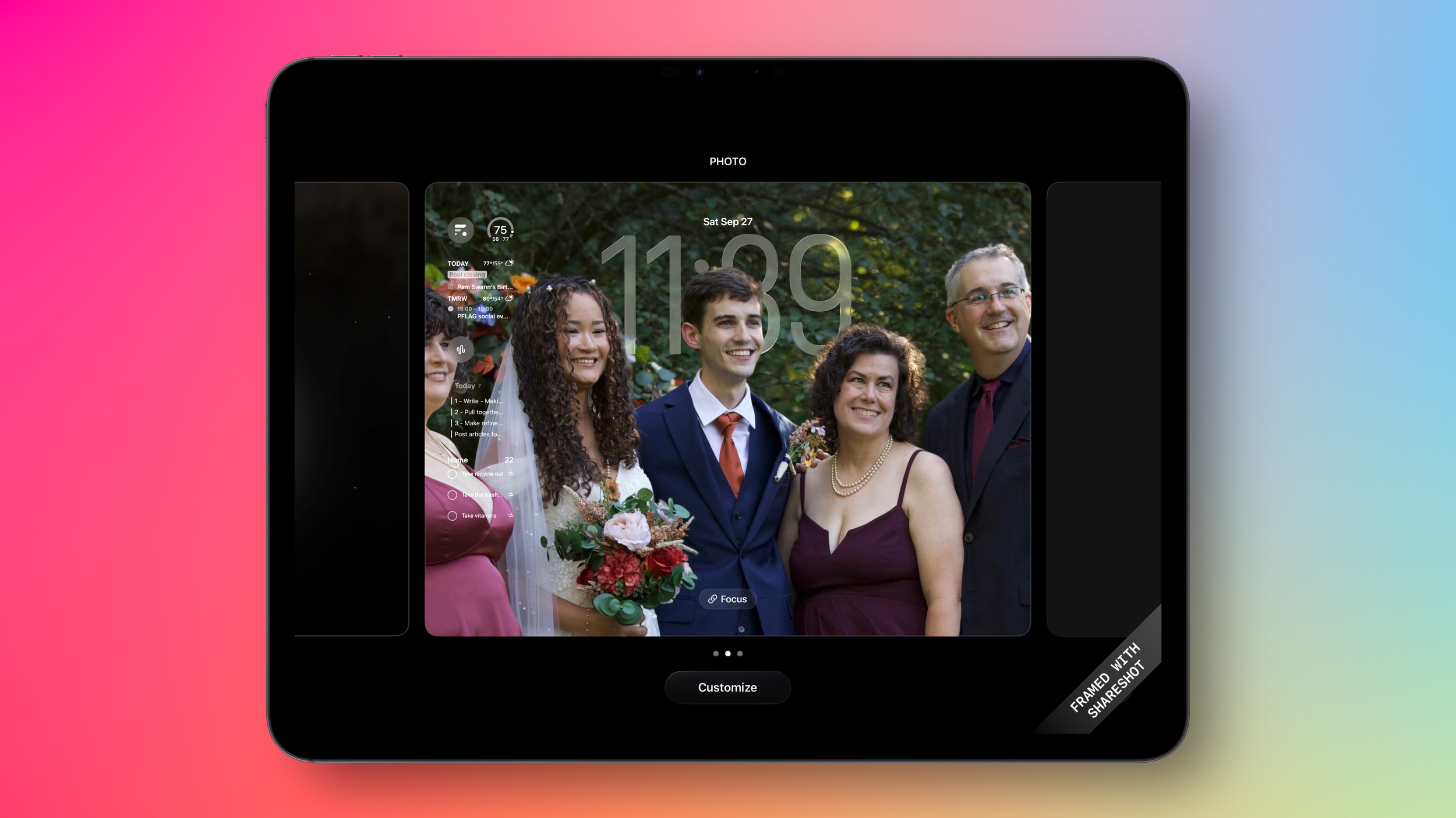
Another place the look and feel comes through are the lock screens. There are some fun changes you can make to the size and look of the clock and your pictures. It is the small things Apple is doing that can make the biggest difference. For the picture options, you can now select from your photo library and select the ‘depth effect’ to add the special elements to your existing picture. This gives it a 3-D effect and can even allow people or them to appear to sit in front of, or behind, the clock. It locks the subjects of the picture in the foreground and creates a depth to the background, allowing a very neat effect when you move the screen. Again, this is more fun than practical, but we use our devices so much, having these clever little items makes them more fun to use.
Camera app/settings
The Camera app received some updates as well. I find these to be helpful and intuitive changes. The biggest is the ‘camera picker’. At the bottom of the screen, you now only see ‘video’ or ‘photo’ instead of the full range of different camera settings you can have. I like this because the majority of people either want to jump right into taking a picture or capture video. The other options of slo-mo, portrait, pano are all still there, you just need to slide your finger over them, scroll towards the photo side and get all the photo options. Scroll towards the video side and you’ll see all the video options. I think this makes it much easier to get into the quickest options faster. After all, most of us just want to get a picture or video as quickly as possible.
All the other settings are available with a quick tap from the top right. That will bring up the more detailed options for your photos or videos. This feels more intuitive than before, both in placement and how the controls are arranged when they come up. Again, if you don’t need these, they are out of the way. If you do, they are quickly accessible.
Search bars consistent (at bottom)
Apple is bringing consistency into their apps and encouraging developers to do the same thing. Knowing where a search bar is going to appear on the screen helps to use the applications better and faster. Most of the Apple apps now have the search bar at the bottom of the screen for the iPhone, making it easier to use the keyboard and keep your hands in the same place. (Oddly, Reminders seems to buck this trend.) The iPad and Mac apps remain where expected for more of a keyboard-driven environment. I’ve noticed many of the apps I use daily from other vendors now follow this approach as well. Consistency matters.
Backgrounds for messages
Surprisingly, this is one of my favorite new features. More than once, I have found myself sending messages to the wrong person or group chat because I didn’t realize which message thread I was in. By having distinct backgrounds for certain message strings, it is much easier to see which one you’re in, versus knowing or looking at the top of the screen. Plus, you can have some fun pictures of the person or people you are messaging with. Again, the small things make a difference this year.
Who would think ‘snooze’ is a key feature?
Finally, you can change the length of snooze to what you want. If the current 9 minutes is too long for you, now you can shorten it to whatever you want. 9 minutes isn’t nearly enough for you? Change it to be longer. Just make sure you don’t fall too deeply back to sleep. From a sleep habit and productivity standpoint, my advice is skip the snooze button altogether. But for those mornings when you just need a few more minutes, you’re not confined to only the 9-minute option.
Updates for Reminders
I was disappointed that there weren’t many new features added for Reminders this year. However, that is not to say that there are no new updates. With this year’s update to iOS, Reminders does get a new ‘auto categorize’ option. This was available with grocery lists, but now Apple Intelligence enables doing this for any list that would have natural categories. For example, a packing list might be able to sort into things like clothes, electronics, and toiletries. I gave this a try with some example items, and it worked really well. You can see the screenshots below. I did this on an iPad, but you can do this on any Apple device running xxx26. This is one example of having a more unified approach to the operating system across all devices. The parity between what you can do on them is much closer now. New features apply to all, not some.
Recommendation
I’ll cover this more with my iPadOS update next month, but learning and building muscle memory for keyboard shortcuts cuts on your iPad will be a huge time saver for you. I think that is the case for any devices you can use a keyboard with. If you connect a keyboard to your phone, learn keyboard shortcuts. For Windows and Mac users, keeping your hands on the keyboard can cut so much friction out of regular activities and save you time you didn’t realize was getting wasted away.
Overall, I think the iOS 26 updates are bigger than they appear to be. The look is immediately noticeable, and it would be easy to ask, “what else did they change?” But I think the small, subtle changes that are being made are big leaps for usability and consistency across the operating systems. As I’ve mentioned, I see Apple unifying the operating systems to feel much more similar across the board. Whether you are using a Mac, iPhone, iPad, or other device, the look, feel, and flow of the interfaces are more and more similar. This will make it easier for users to use the device of choice for the work they need to get done. Simple. Consistent. Intuitive. Very Apple.
What changes do you like most in the new versions of iOS 26?
Get leadership tips and new articles you can use directly to your inbox. Join the thousands of other leaders continuing your leadership development journey with **Effective Retail Leader.com. **
DISCLAIMER: I participate in the Amazon Services LLC Associates Program, an affiliate advertising program designed to provide a means for me to earn fees by linking to Amazon.com and affiliated sites. Other links to third-party products and services may also be affiliate links.


